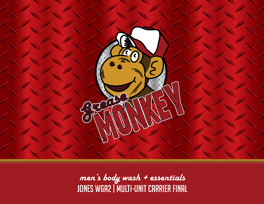
Grease Monkey
College Package Design Project
College Package Design Project
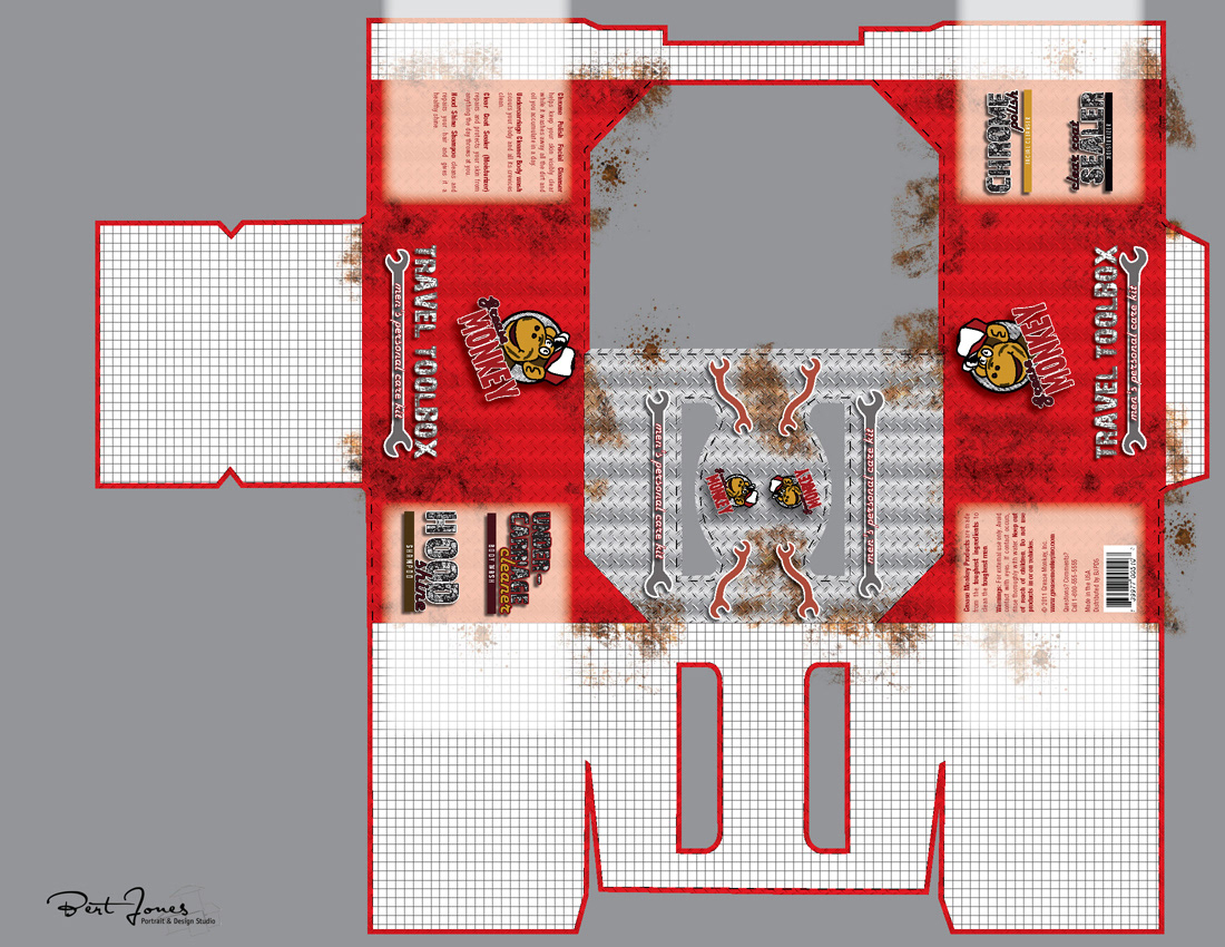
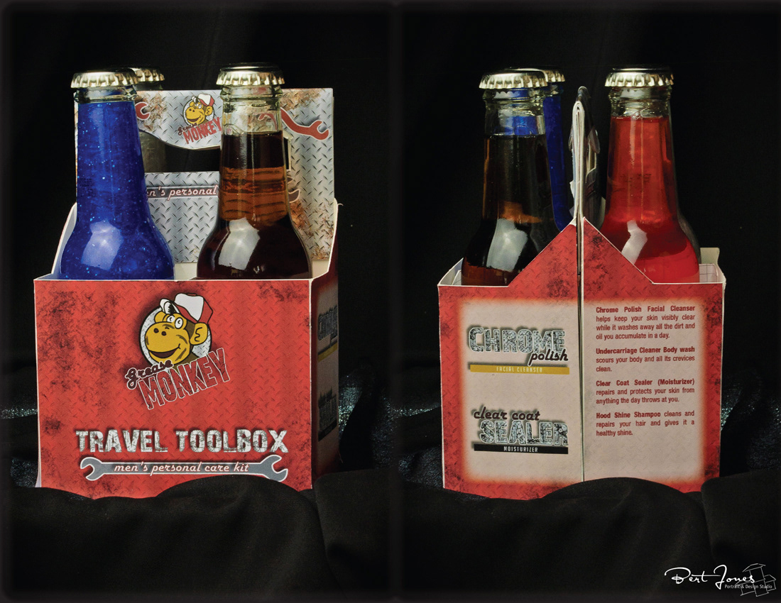
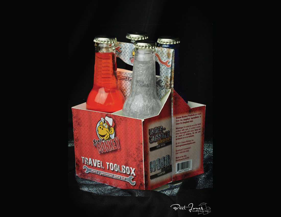
During college, I had a packaging design class. Our final project was to design a brand and packaging for a multi-unit carrier (and contents) for a men's product. A secondary goal was to find unique parings that consumers wouldn't necessarily think would go together (to help create a "gimmick").
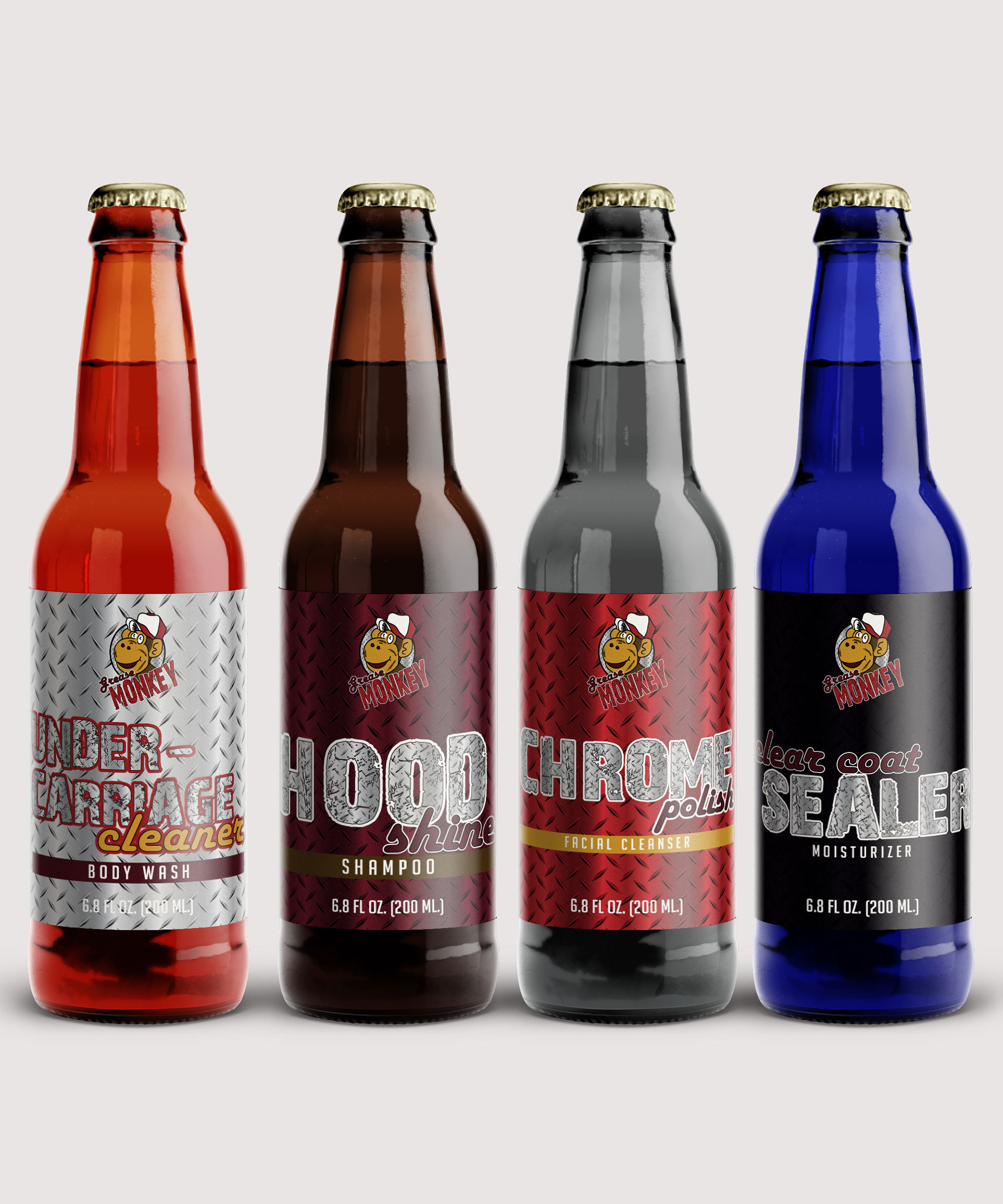
My goal was to create a product that would appeal to men, using a garage theme and packaging the product in beer bottles. As well as use unique textures and colors for the liquid in the bottles that would coordinate well with their names.
My goal was to create a product that would appeal to men, using a garage theme and packaging the product in beer bottles. As well as use unique textures and colors for the liquid in the bottles that would coordinate well with their names.
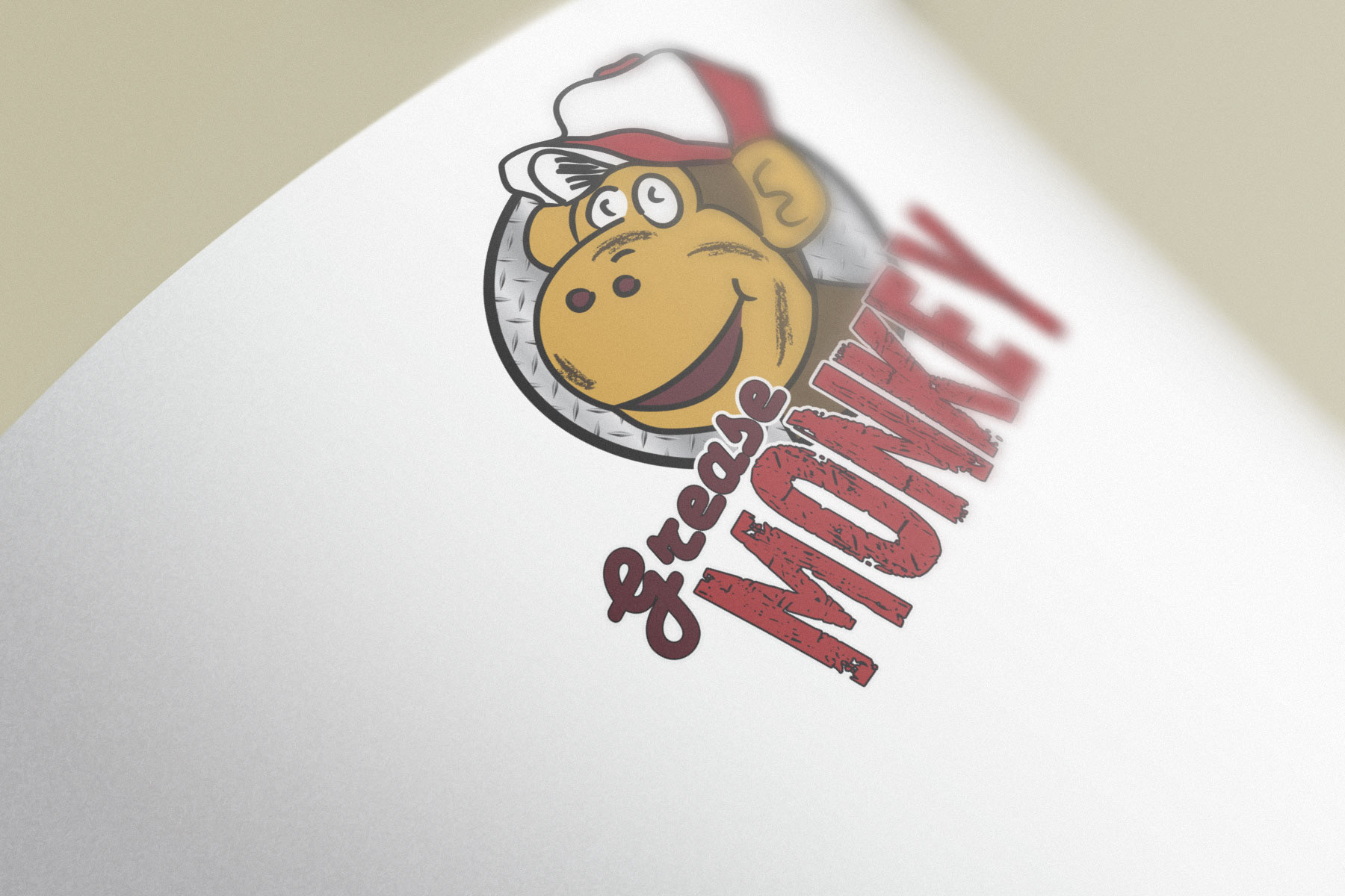
Once I had a name, "Grease Monkey", I chose a logo that would literally display that.
I then came up with names that would use garage terminology. I also wanted the terminology to coordinate well with the actual product use.
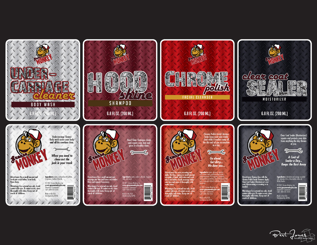
For the liquid inside, I chose colors/textures that would correspond with items you would find in a garage. Body wash had a reddish-orange color to correspond to transmission fluid, the shampoo had a dark viscous brown for motor oil, facial cleanser/chrome polish a steel-like texture and the moisturizer/sealer a blue.
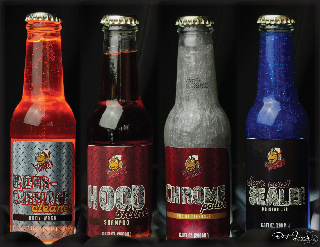
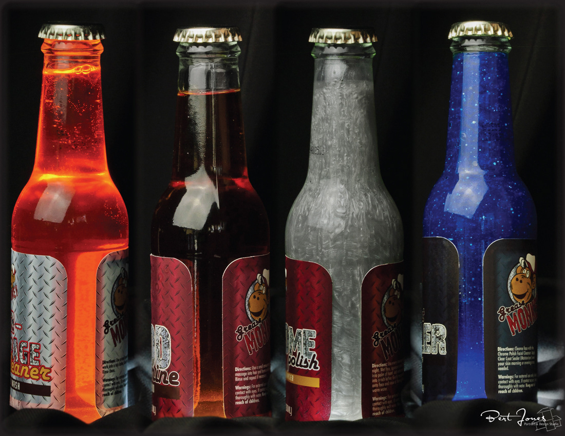
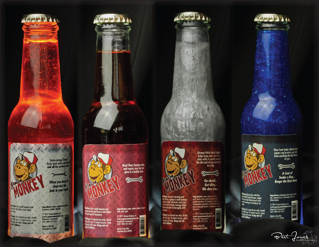
I added rust to the container to give it a more worn look.